Managing preferences
DEMETER has a mountain of preferences available for the user to
tinker with. This may, I suppose, be a problem. There is a school of
thought in user interface design that asserts that a program should be
simple, offering the user a small number of carefully considered
configurable options, all of which have sensible defaults. That sort
of thing is usually considered “user friendly”,
while a dizzying array of configrable options if conisdered to be
hostile to the user.
I don't disagree with that. However, I am not so lucky as to
have teams dedicated to user interface design and product testing. I
don't have the luxury of testing design decisions to determine if
they are successful.
Unfortunately, there are a lot of aspects of the software that need
sensible default values. In general, I have a good idea what a
sensible value might be, but I am rarely certain. My solution for any
option or parameter whose sensible default is open to interpretation
is to make it configurable. As a result, there are almost 300 aspects
of DEMETER that can be configured, ranging from default parameter
values to the colors of things that get plotted.
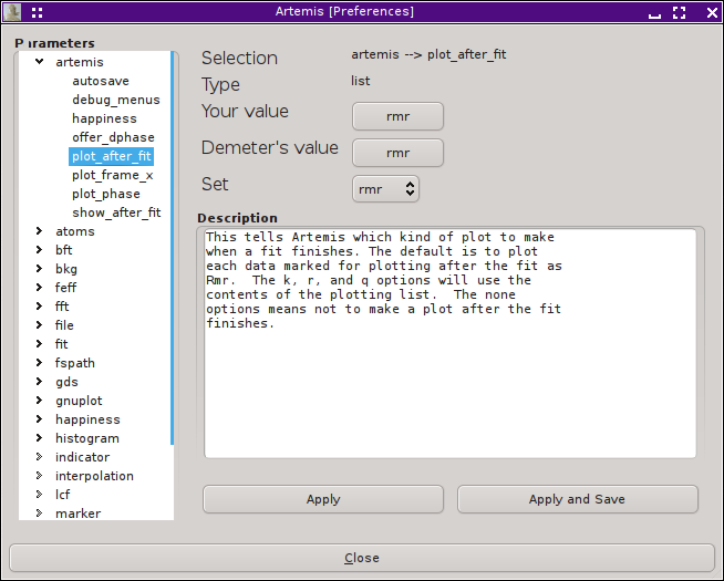
 ARTEMIS presents all of DEMETER's configuration options
in the Preferences window, which can be displayed from the File Menu.
Shown here, the “artemis” group has been
opened and the ♦Artemis → plot_after_fit
option has been selected. Since it takes one of predefined list of
possible values, you are presented with an option menu for selecting
among the possibilities. The default value can be restored by
pressing the button labeled as DEMETER's default. In the
text area, the option is described.
Once you change an option, you can apply it to the current session or
apply it and save its value to DEMETER's initialization
file.
Different configuration options take different kinds of values. For
example, some are filenames, strings, real numbers, integers, colors,
and so on. Controls appropriate to the value type will be provided
when the option is clicked on.
| ![[Artemis logo]](./../images/Artemis_logo.jpg)
