5.5. Special plots for XAS data
5.5.1. Special plots for the current group
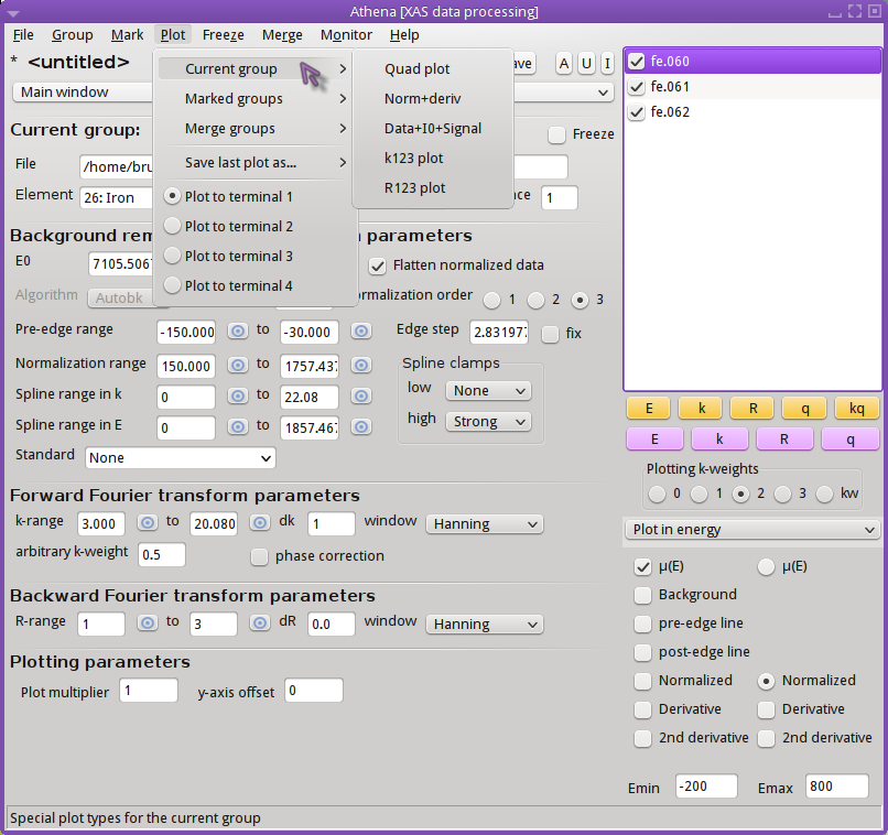
Fig. 5.14 A number of special plots and other plotting features are provided for visualizing particular aspects of your data. The plot types described below are all available from the Plot menu.
- Quad plot
The quad plot is the default plot that gets made when data are first imported. Using the current set of processing parameters, the data are displayed in energy, k, R, and back-transform k all in the same plot window. This plot can also be made by right-clicking
 on the kq
button.
on the kq
button.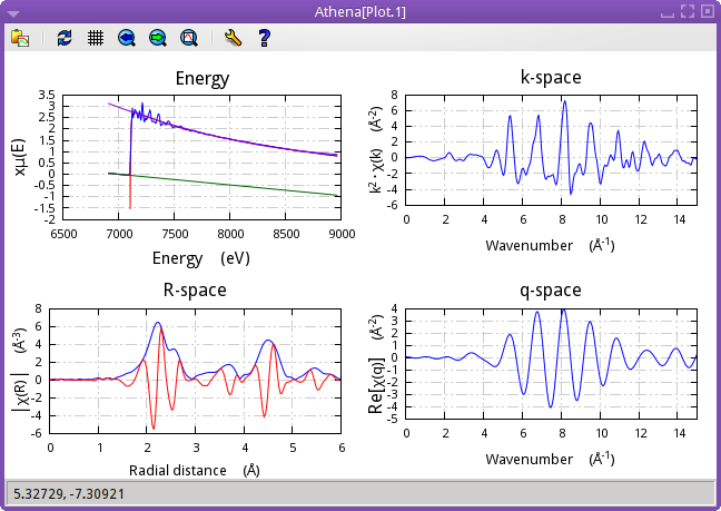
Fig. 5.15 Quad plot of Fe foil.
- Normalized data and derivative
This plot type shows the normalized μ(E) spectrum along with its derivative. The derivative spectrum is scaled by an amount that makes it display nicely along with the normalized data.
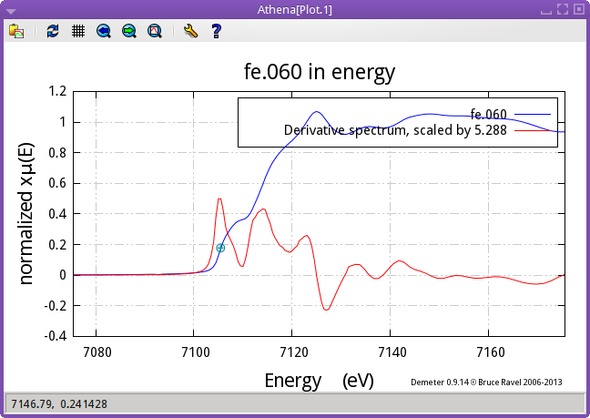
Fig. 5.16 Norm and deriv of Fe foil
- Data + I0 + signal
I0 can be plotted along with μ(E) and the signal as shown below. The I0 and signal channel is among the data saved in a project file. This example shows μ(E) of Au chloride along with the signal and I0 channels. This plot can also be made by right-clicking on the E button. (The norm+deriv plot can be configured for right-click
use with the
♦Athena→right�_single�_e configuration parameter.)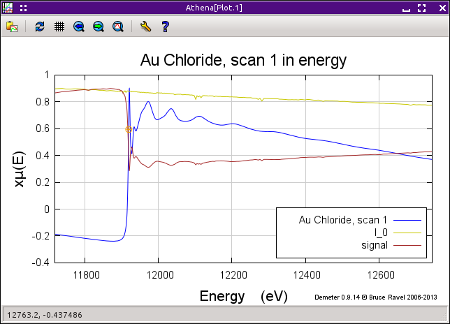
Fig. 5.17 mu(E) of Au chloride along with the signal and I0 channels.
- k123 plot
A k123 plot is a way of visualizing the effect of k-weighting on the χ(k) spectrum. The k1-weighted spectrum is scaled up to be about the same size as the k2-weighted spectrum. Similarly, the k3-weighted spectrum is scaled down. This plot can also be made by right-clicking
on the k button.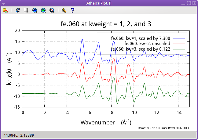
Fig. 5.18 k123 plot of Fe foil
- R123 plot
A R123 plot is a way of visualizing the effect of k-weighting on the χ(R) spectrum. The Fourier transform is made with k-weightings of 1, 2, and, 3. The FT of the k1-weighted spectrum is scaled up to be about the same size as the FT or the k2-weighted spectrum. Similarly, the FT of the k3-weighted spectrum is scaled down. The current setting in the R tab is used to make this plot. For this figure, the magnitude setting was selected. This plot can also be made by right-clicking
on the R
button.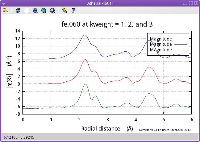
Fig. 5.19 R123 plot of Fe foil
5.5.2. Special plots for the marked groups
The submenu offers two special kinds of plots relating to the set of groups in the group list that have been marked.
- Bi-Quad plot
This special plot is like the quad plot described above, but is used to compare two marked groups. To make this plot you must have two – and only two – groups selected from the group list. This plot can also be made by right-clicking
on the
q button.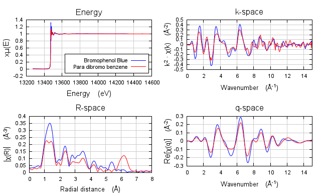
Fig. 5.20 A quad plot comparing two marked groups.
- Plot with E0 at 0
This special plot is used to visualize μ(E) spectra measured at different edges. Each spectrum, Cu and Fe in this example, is shifted so that its point of E0 is displayed at 0 on the energy axis.
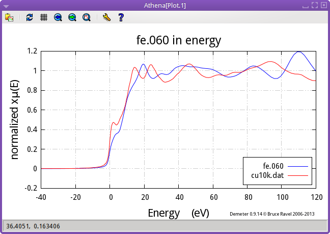
Fig. 5.21 Plot of Fe and Cu foils with E0 at 0.
- Plot I0 of marked groups
This plot allows examination of the I0 signals of a set of marked groups. This plot can also be made by right-clicking on the E button. (The other two special marked groups plots can be configured for right-click
use with the
♦Athena→right�_marked�_e configuration parameter.)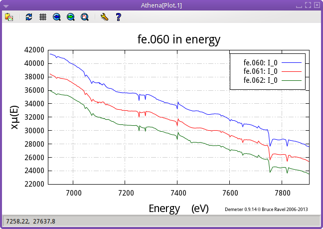
Fig. 5.22 The I0 signals of three marked groups
- Plot scaled by edge step
The marked groups can be plotted as normalized μ(E), but scaled by the size of the edge step. Without flattening, this is identical to plotting the μ(E) data with the pre-edge line subtracted. Otherwise, it is different in that the post-edge region will be flattened and will oscillate around the level of the edge step size.
Fig. 5.23 Plot of normalized data scaled by edge step.
5.5.3. Special plots for merged groups
When data are merged, the standard deviation spectrum is also computed and saved in project files. The merged data can be plotted along with its standard deviation as shown in the merge section (Figure Fig. 9.7) in a couple of interesting ways.
- Merge + standard deviation
In this plot, the merged data are displayed along with the standard deviation. The standard deviation has been added to and subtracted from the merged data. This is the plot that is displayed by default when a merge is made. This behavior is controled by the ♦Athena→merge�_plot configuration parameter.
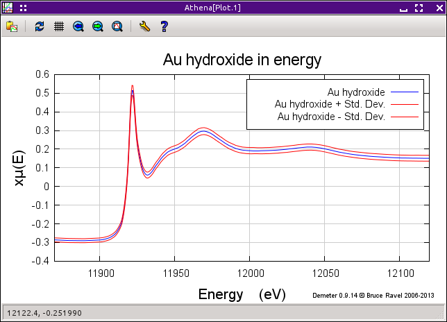
Fig. 5.24 A plot of merged data +/- the standard deviation for Au hydroxide data
- Merge + variance
In this plot, the standard deviation spectrum is plotted directly. It is scaled to plot nicely with the merged data. The point of this plot is to see how the variability in the data included in the merge is distributed in energy.
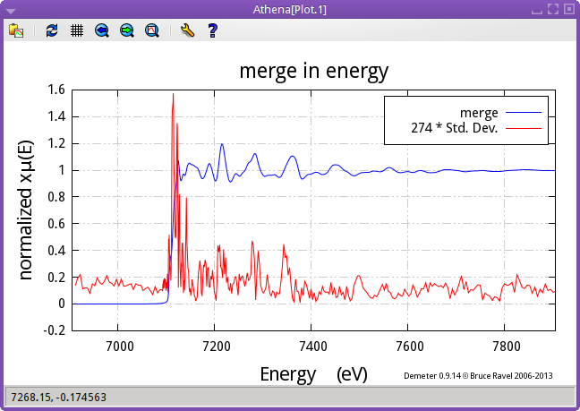
Fig. 5.25 A plot of merged data and the variance for Fe foil data
5.5.4. Phase corrected plots
When the phase correction check button is clicked on, the Fourier transform for that data group will be made by subtracting the central atom phase shift. This is an incomplete phase correction – in ATHENA we know the central atom but do not necessarily have any knowledge about the scattering atom.
Note that, when making a phase corrected plot, the window function in R is not corrected in any way, thus the window will not line up with the central atom phase corrected χ(R).
Also note that the phase correction propagates through to χ(q). While the window function will display sensibly with the central atom phase corrected χ(q), a kq plot will be somewhat less insightful because phase correction is not performed on the original χ(k) data.
5.5.5. XKCD-style plots
ATHENA can make plots in a style that resembles the famous XKCD comic.
To make use of this most essential feature, you should first download and install the Humor-Sans font onto your computer.
Once you have installed the font, simply check . Enjoy!
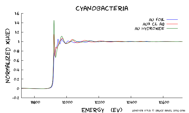
Fig. 5.26 A plot sort of in the XKCD style.
DEMETER is copyright © 2009-2016 Bruce Ravel – This document is copyright © 2016 Bruce Ravel
This document is licensed under The Creative Commons Attribution-ShareAlike License.
If DEMETER and this document are useful to you, please consider supporting The Creative Commons.