5.3. Other plotting options
5.3.1. Zooming and cursor position
Zooming on a region of a plot is done using Gnuplot's own
capabilities. In the plot window, a zoom is initiated by a right
click  . The mouse is then dragged to cover a rectangular
area on the plot. Right-clicking a second time will cause
the plot to be redisplayed on the zoomed region.
. The mouse is then dragged to cover a rectangular
area on the plot. Right-clicking a second time will cause
the plot to be redisplayed on the zoomed region.
Gnuplot displays the position of the cursor in the bottom part of the plot window. This is continuously updated as the mouse moves over the plot window.
5.3.2. Special plotting targets
The Plot menu provides a few more ways to control how your data are displayed. The submenu allows you to send the most recent plot to a PNG or PDF file. You will be prompted for a filename, then the most recent plot will be written to that file in the format specified. Currently, only PNG and PDF are supported. Saving to a file does not work for quad plots – you'll have to rely on a screen-capture tool for that.
Finally, you have the option of directing the on-screen plot to one of four terminals. The selected terminal, number 1 by default, is updated as new plots are made. When you switch to a new terminal, other active terminals will become unchanging. This means you can save a particular plot on screen while continuing to make new plots.
Todo
ATHENA should offer other vector output images, like SVG or EPS. Also should make the number of terminals a configurable parameter.
5.3.3. Stacked plots
When marked group plots are made using the purple plot buttons, the default behavior is to overplot the various data groups. At times, it might be preferable to place an offset between the plots. This is done in general by setting the «y-axis offset» parameter. Stacking plots in a systematic manner is done using the stack tab. Stacking is done by setting the «y-axis offset» parameters of the marked groups sequentially.
This tab contains two text entry boxes. The first is used to set the «y-axis offset» parameter of the first marked group. Subsequent marked groups have their «y-axis offset» parameters incremented by the amount of the second text entry box. Clicking the Apply to marked button sets these values for each marked group.
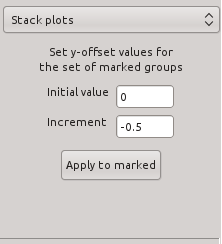
Fig. 5.6 The plot stacking tab.
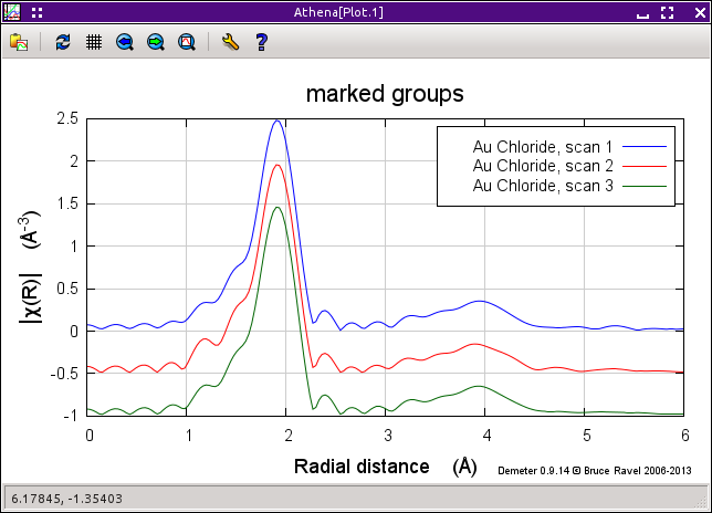
Fig. 5.7 An example of a stacked plot. Note that the stacking increment is negative so that that order of the colors is the same in the legend as in the plot.
5.3.4. Indicators
Indicators are vertical lines drawn from the top to the bottom of the plot frame. They are used to draw attention to specific points in plots of your data. This can be useful for comparing specific features in different data sets or for seeing how a particular feature propagates from energy to k to q.
Points to mark by indicators are chosen using the pluck buttons in the indicators tab. Click on the pluck button then on a spot in the plot. That value will be inserted into the adjacent text entry box. When the check button is selected, that indicator lines will be plotted (if possible) in each subsequent plot.
Points selected in energy, k, or q are plotted in any of those spaces. Points selected in R can only be plotted in R. Points outside the plot range are ignored.
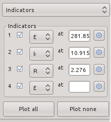
Fig. 5.8 The indicator tab.
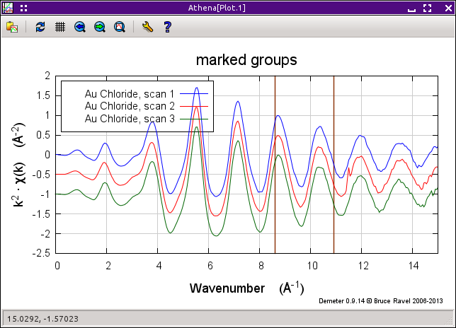
Fig. 5.9 An example of a plot with indicators. Note that plots made in E, k, or q will plot indicators selected in any of those three spaces.
The following preferences can be set to customize the appearance of the indicators.
- ♦Plot→nindicators: the maximum number of indicators that can be set
- ♦Plot→indicatorcolor: the color of the indicator line
- ♦Plot→indicatorline: the line type of the indicator
5.3.5. Title and legend
Fine grained control over the title and legend of the plot is available in the Title, legend, single file tab.
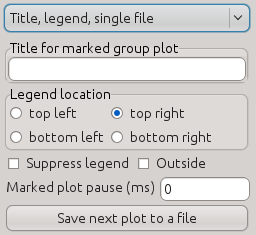
Fig. 5.10 The tab with controls for the title and legend of the plot as well as plot pausing and single file output.
Normally the title of a marked group plot is determined from the name of the project file. If there is not yet a name for the project file, then the title of a marked groups plot (i.e. one made with a purple plot button) will be “marked groups”.
This behavior can, however, be overridden by specifying a title in the text box labeled Title for marked group plot. The text specified there will be used as the title. The title for a marked group plot can be suppressed by specifying one or more spaces in that text box.
The plot legend is place, by default, near the inner, top, right corner of the plot. This sometimes interferes with the display of the data. The corner can be selected using the radio buttons in the Legend location box. The placement of the legend inside or outside of the frame of the plot is controlled by the Outside check button. Checking the Suppress legend button causes the legend not to be displayed.
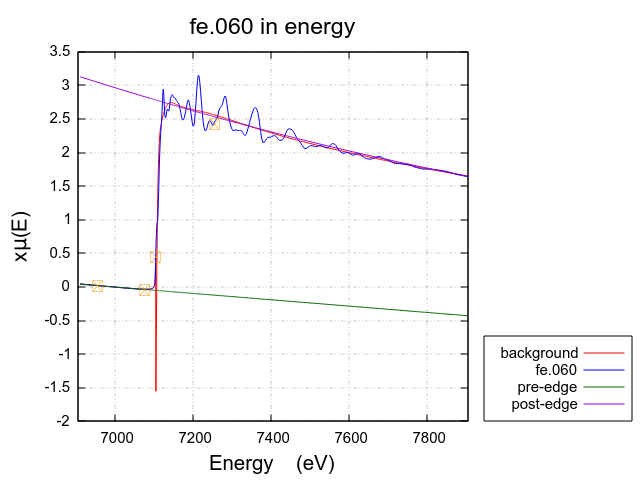
Fig. 5.11 Plot of Fe metal showing the legend outside the plot frame and in the lower right corner.
5.3.6. Pausing display of data during import
When examining a sequence of XAS scans, it can be instructive to focus on the scan-to-scan changes in the data, When the text box next to Marked plot pause in Fig. 5.10 is set to a non zero value, there will be a pause introduced between the display of the groups included in a marked group plot.
For example, consider a sequence of data in the reduction of hexavalent chromium to trivalent chromium. Standards for these two forms of chromium are shown below.
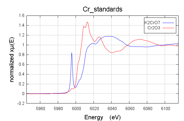
Fig. 5.12 Hexavalent chromium, with its large pre-edge peak, plotted with trivalent chromium.
As the reduction progresses, the size of the pre-edge peak diminishes and the main rising edge shifts to the right. A pause introduced to the marked group plot serves to animate the spectral change during this reduction.
The value of this pause is in milliseconds. A value of 250 or 500 is good starting point. The value of zero turns off this animation feature and the plot will be made as quickly as possible.
5.3.7. Single file output
ATHENA has some fancy plots hardwired. reproducing these plots in another plotting program using ATHENA's column output files can be tricky.
To make it easier to reproduce plots made by ATHENA, there is an option to export the content of a plot to a single column data file. This is enabled by toggling the Save next plot to a file button shown in Fig. 5.10.
When toggled on, the next plot made will directed to a file rather than to the screen and you will be prompted for the name of the output file. Any y-axis shifts or scaling factors will be included in the data written to that column data file. Using the data from that file, stacked plots like Fig. 5.7, k123 plots like Fig. 5.18, and others can be reproduced easily.
Once the single file output is written, the Save next plot to a file button will toggle off. The nextplot that is made will be directed again to the screen.
Note that single file output will not include plot markers or indicators, nor can it be used to reproduce all four panels at once of a quad (Fig. 5.15) or bi-quad (Fig. 5.20) plot.
DEMETER is copyright © 2009-2016 Bruce Ravel – This document is copyright © 2016 Bruce Ravel
This document is licensed under The Creative Commons Attribution-ShareAlike License.
If DEMETER and this document are useful to you, please consider supporting The Creative Commons.